
Cracking the Code of Colour Temperature
Have you ever added more white to your painting, hoping to create sunlight — only to end up with something chalky or flat? You're not alone.
Many painters — even experienced ones — instinctively reach for warm colours in the light and cool ones in the shadow. It feels right. After all, sunlight is warm, and shade feels cool... doesn’t it?
But here’s the twist:
To give the effect of light in a painting, we often need to do the opposite.
Cool colours in the highlights, and warm colours in the shadows.
It’s a principle I learned during my time studying at an atelier, reinforced by my mentor Stefan Baumann, and used to extraordinary effect by painters like John Singer Sargent. It’s one of the most powerful — yet often misunderstood — tools in a painter’s kit.
Why It Works
In the real world:
Most natural light sources are cool (think of the bluish tint of daylight).
Shadows are rarely "just dark." They’re often warmed by reflected light from surrounding surfaces — soil, walls, clothing, skin, or even the atmosphere itself.
By reversing our instincts and painting cooler lights and warmer shadows, we give the viewer’s eye what it expects to see — not what we assume is "correct."
This shift creates the illusion of light without the need for harsh value contrast. It softens transitions, adds vibrancy, and helps avoid two of the most common problems in painting:
❌ Chalky highlights (from too much white or warm tones in light)
❌ Muddy shadows (from dull or overly dark cools)
Examples in Action
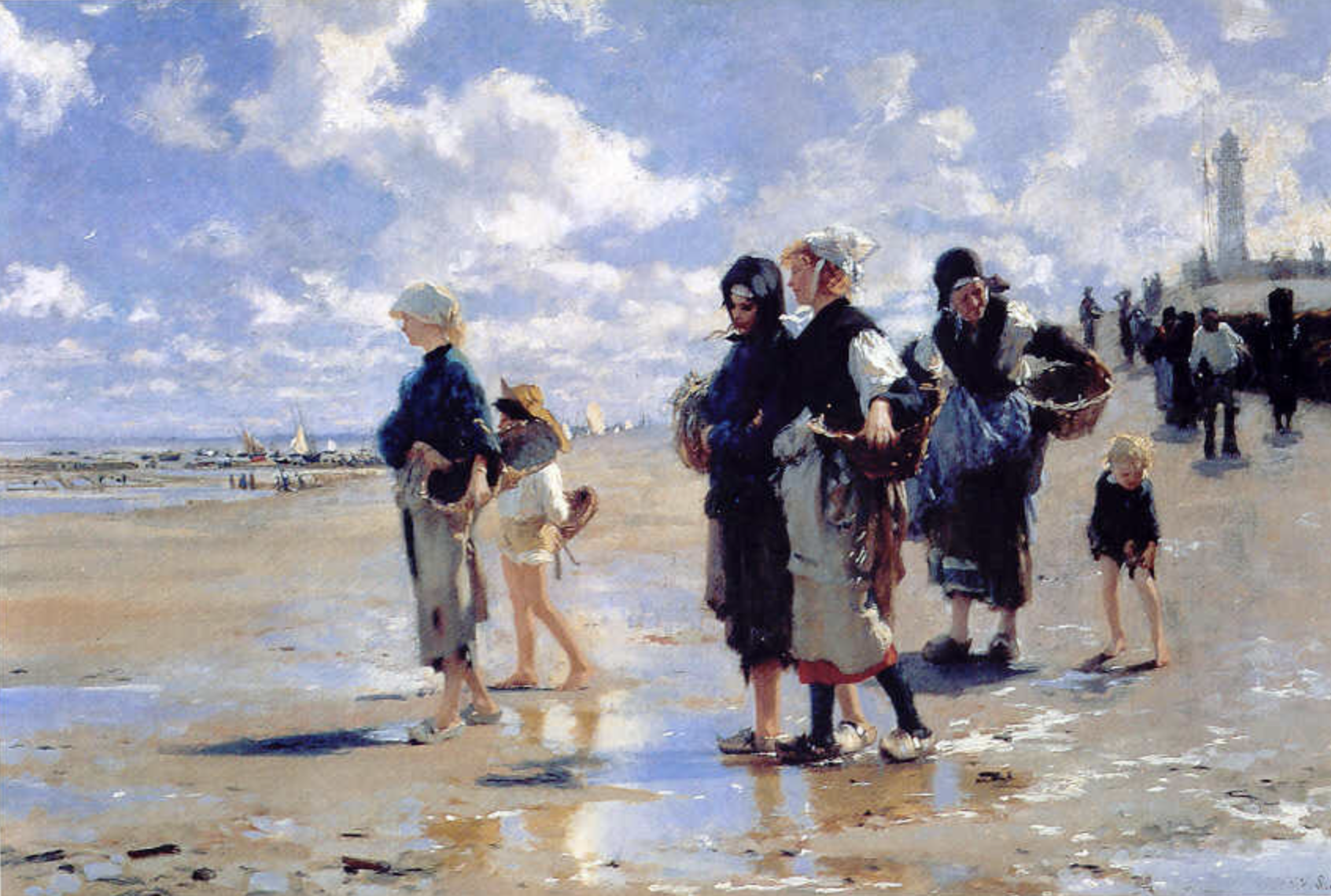
Take **Sargent’s **Oyster Gatherers of Cancale. (above) Look at the sand: the value barely changes, but the surface is alive with colour. He alternates warm and cool strokes — golden ochres beside lavender greys — to create atmosphere and movement.
You can use this technique in any large shape that feels flat:
beaches, skin tones, skies, foliage, water, walls…
Cheryl’s Practical Tips for Using Temperature
1. Use Cool Colours in the Light
Lemon Yellow
Cerulean Blue
Titanium White
Phthalo Blue
Quinacridone Rose
Phthalo Red Rose
Manganese Blue
Veridian Green
Pthalo Yellow Green
These help your highlights feel airy, fresh, and light-filled — without becoming chalky.
2. Use Warm Colours in the Shadows
Ultramarine Blue
Transparent Red Oxide
Violet
Asphaltum (Michael Harding)
Burnt Umber
Yellow Ochre
Cadmium Yellow Deep
Cobalt Blue (warm version)
Alizarin Crimson
They give your shadows subtle glow and energy — even when dark.
3. Set Your Palette Up for Success
I arrange my colours like this:
Warm. (right side of palette) ➞ Titanium White (middle ) ➞ Cool (left side of pallet)
It gives my hand a natural “temperature map” when mixing. I encourage students to do the same — and it works!
Bonus Tip: If It Looks Dead, Shift the Temperature
Sometimes a shape looks fine in value, but it feels dead. It might not need more light or shadow — it might just need a temperature shift.
Try alternating warm and cool notes within the same value range. It's subtle, but the effect can be magical.
Final Thought
Painting isn’t just about matching what we see — it’s about creating the illusion of life.
Understanding temperature gives you the power to suggest light, depth, volume, and mood — without relying on heavy contrast or harsh outlines.
Once you begin to feel the difference between warm and cool — not just on your palette, but in your brushstrokes — you’ll wonder how you ever painted without it.
Want to go deeper?
My students receive a Mini Mastery Card on Colour Temperature in every workshop. A new card on "Temperature in Action" is coming soon. Perfect for your studio wall or sketchbook.